
What do your logo's colors actually mean?
Have you ever thought about the effect your brand’s colors have on people? Think about your company’s logo. Do the colors fit the feelings you want to be associated with your company? I understand how strange it can sound to think that a color can make people feel a certain emotion. But before you dismiss color psychology all together, consider this example.
Day after day, we see the color blue in a prominent way. Whether it’s the sky above us or in bodies of water, those large blue elements will consistently be there and we can count on them to rarely ever change. In fact, we see them so often that they just blend into the background of our lives. So, when we see blue, we often connect it with the feelings of dependability and trust.
It shouldn’t be surprising that so many financial companies choose blue as their primary brand color to show their trustworthiness and dependability.
The things we see around us and the ways we relate with the world evoke an emotional connection from every color in the spectrum. So let’s take a look at the colors some popular brands have chosen and where their meanings come from.
Red
Passion, excitement, power, confidence
Red’s intensity and extreme visibility can often provoke the strongest emotions. For example, the majority of fast food restaurants use red to grab attention and encourage action. Many other brands like Coca-Cola or Lego use red to express excitement or passion for their products.
Since red can also be associated with danger, you may consider using it sparingly so it doesn’t feel overwhelming for people. For example, even though my company is called “Red Bicycle,” we use red as an accent rather than in large blocks of color.

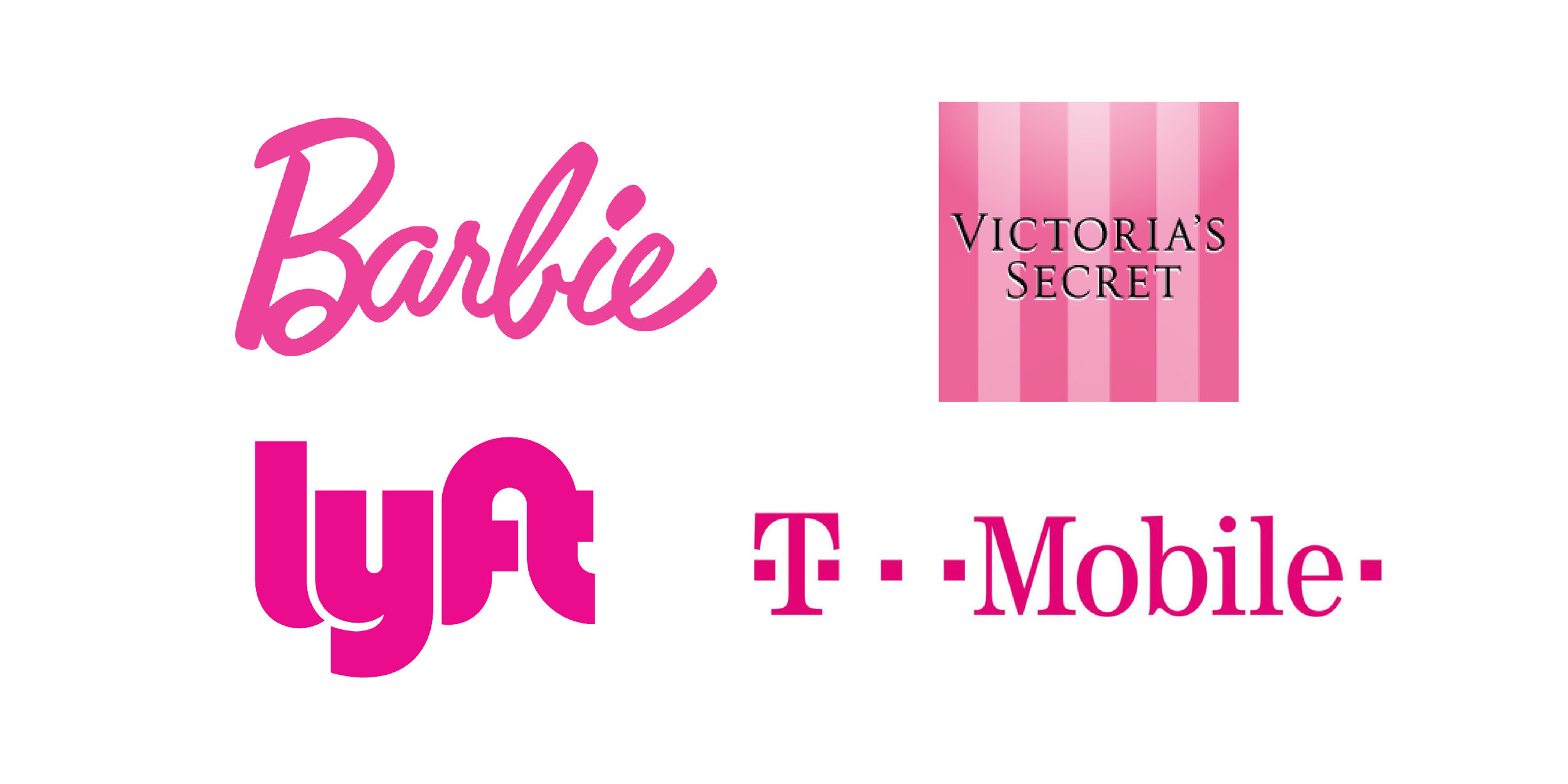
Pink
Love, care, nurture, feminine
The meaning of the color pink revolves around femininity, playfulness and love, so it’s no surprise it is often used to connect with an exclusively female audience. Alternatively, some companies, whose customer base isn’t primarily women, choose pink as a bold way to be different in a flooded or already dominated market (i.e. Lyft or T-Mobile).
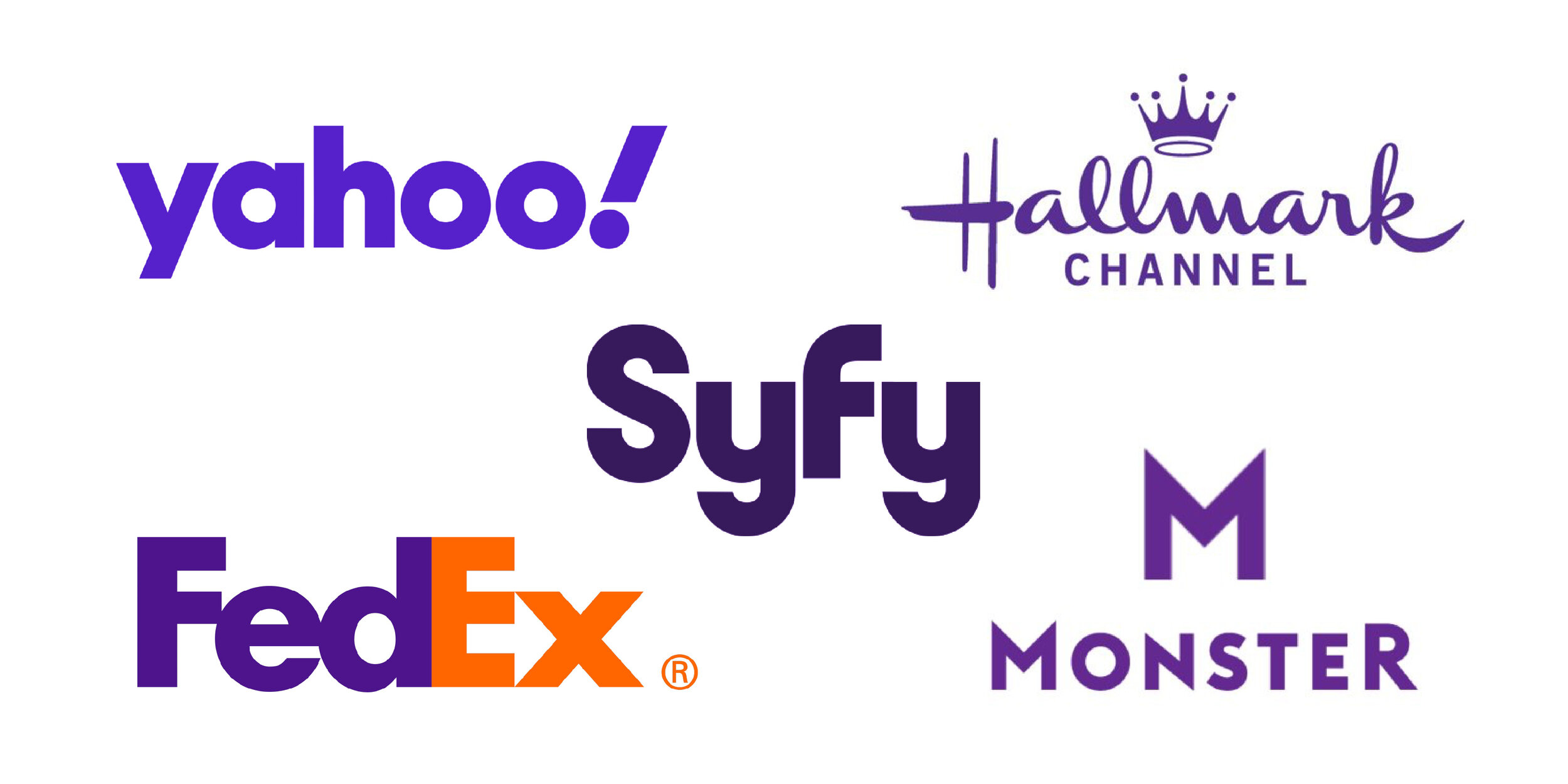
Purple
Creativity, Unconventional, wealth, wisdom
For centuries the color purple has been associated with power, luxury and royalty. This is largely due to the rarity and cost of the dye originally used to produce it. In fact, at one point, Queen Elizabeth I forbad anyone except close members of the royal family to wear it.
Today, even though the cost of creating purple is no different than any other color, the association of exclusivity and wealth stuck.
Blue
Trust, Loyalty, peace, responsible
As I mentioned earlier, in color psychology, the color blue is tied closely to feelings of stability, calm, trust and dependability. Using blue can be especially helpful if trust is crucial in your industry. For example, tech brands like Facebook, Twitter and Skype that have access to your personal information want to reinforce a sense of trust with their brands. Also brands like Walmart and Oral B use blue to show their products as safe and reliable.

Green
Growth, tranquility, health, safety
Green has a clear psychological connection with nature. A plant’s rich green color is typically a sign that it’s healthy and growing. So, a lot of brands use green to show their focus on your health or nature. Alternatively, many logos utilize green to present a safe and peaceful brand experience.

Yellow
Optimism, clarity, warmth
Yellow is the lightest hue in the spectrum, so it is often associated with happiness, warmth and optimism. Most tangibly, it’s associated with the feeling of warm sunshine. Many brands use yellow to express a positive experience or service.

Orange
Confidence, impulse, cheerful, friendly
Orange is a combination of the energy of red and the optimism of yellow. So, it is often used to represent lightheartedness or creativity. It’s eye-catching but not as intense or overbearing as a stark red could be. Brands like Nickelodeon and Amazon use orange to present an enthusiastic and friendly personality in their brand.

Multicolor
Diversity, universal
For some brands with a diverse list of services, products, or customers, it makes more sense to connect with a variety of emotions. For example, Ebay offers countless types of products across virtually every category. And the vast range of Google’s services are used by an incredibly diverse audience. So, using multiple colors helps express their goal of being universally beneficial for everyone.
